The Mount of the Golden Queen
The main project I have decided upon for my final major project is to create illustrations for a picture book of the Swedish folktale, 'The Mount of the Golden Queen'. I have also decided that I would like to have a fully populated Kickstarter page for the project as my final outcome, to be completed by the end of the semester.
This project is larger than any we have ever had to complete in the past I began by carrying out quite a bit of planning in order to ensure that I had all of the project details planned out and scheduled so I knew that it would be done in time.
This project is larger than any we have ever had to complete in the past I began by carrying out quite a bit of planning in order to ensure that I had all of the project details planned out and scheduled so I knew that it would be done in time.
Research
I started by breaking down the story that I wanted to use, and marking out the key points so I gained a greater understanding of the folktale.
The specific story that I have chosen doesn't have much context or history surrounding it at all, aside from being found within 'The Swedish Fairy Book', which features a series of folktales collected by Clara Stroebe. Therefore, I didn't have an exact time period to research, only that the book was published in 1922. I came up with a list of research points that I felt would be integral for my illustrations, so I began to work through them.
I then moved onto Pinterest research, followed by general research.
Folk art
Swedish Textiles and Clothing
I also found this website going a bit more in depth about clothing that specifically commoner women would wear in Sweden in the 1800's.
Swedish Royalty
Swedish Architecture and Nature
I also found some videos of forestry in Sweden. The videos are quite long, however, this benefits me as it allows me to stop at different parts of the videos and observe the differing characteristics of Swedish forestry, which will be vital for my folktale.
|
|
|
|
Art and Style Inspiration
The Swedish Fairy Book
I also wanted to do some research on the actual book that the tale is found in, just to see if I could gain any context at all on the story.
Clara Stroebe:
Klara Stroebe (sometimes credited as Clara Stroebe) was a editor of several fairy tale books. These stories for children include The Swedish Fairy Tale Book, The Norwegian Fairy Book, and The Danish Fairy Book. These books are part of “The Fairy Book” series released by Frederick A. Stokes Company. Little is known about her life, however, she is believed to have been born in the 1800’s, and be of German heritage.
Book Preface (key points highlighted):
The following volume of Swedish fairy-tales represents a careful choice, after the best original sources, of those examples of their kind which not only appeared most colorful and entertaining, but also most racially Swedish in their flavor. For the fairy-tales of each of the three Scandinavian countries, Sweden, Denmark and Norway, have a distinct local color of their own. The wealth of material available has made it possible to give due representation to most types of fairy-tales, from the stories of older origin, the tales of giant, troll, and werewolf, to such delightful tales as "Lasse, My Thrall", and "The Princess and the Glass Mountain," colored with the rich and ornate stylistic garb of medieval chivalric poesy. There has been no attempt to "rewrite" these charming folk-and fairy-tales in the translation. They have been faithfully narrated in the simple, naive manner which their traditional rendering demands. And this is one reason, perhaps, why they should appeal to young American readers—for young America by instinct takes kindly to that which is straightforward and sincere, in the realm of fairy-tale as in life itself.
Book Research
Imagine a Forest
Imagine a Forest is a book filled with design inspiration for folk art, so I thought it would be extremely helpful in ensuring that my folk art references were authentic.
Textile Folk Art
This book is a guide to folk dress and textiles, and includes lots of up-close imagery displaying the kinds of designs that would be seen on real historical clothing.
The Art and Flair of Mary Blair
Mary Blair is probably my absolute favourite artist, so she always influences me in one way or another. I love the child-like approach she takes, and how that's portrayed in the way she paints.
Leaf
The art style of this picture book isn't my favourite, but I really liked the size of the book, so I thought of possibly using the same size for my own project. I also really liked the intro pages of the book.
Beastly Verse
I picked out this specific book as I really like the composition used, and how the type is integrated into the images. I also really like the tactile appearance of the illustrations.
Secret Life of Pets
I mainly looked at this book as I really enjoy the way the digital gouache style has been used. I think it works very effectively, and definitely has a mid century feel to it, which is a style that I'm massively inspired by.
Arthur and the Golden Rope
After talking to Dwayne about my target audience, he showed me these books as a suggestion of how to make picture books work for a slightly older audience, focusing around ages 8-10. The conversation helped me a lot, and gave me insight into making my story work as it's far too long to suit a preschool age group, as I had initially planned.
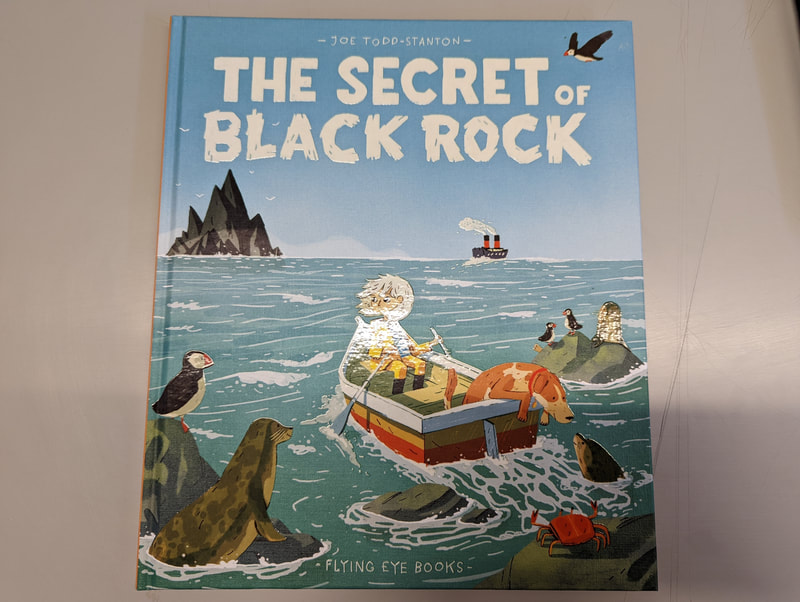
The Secret of Black Rock
Hilda and the Troll
I wanted to get my hands on something physically that was for my target audience so I had a good reference for tone and illustration type so I thought Hilda was perfect.
YouTube Resources
I also found quite a few videos of illustartors discussing their process, which I found to be very helpful as it provided me insight into the way they think and navigate through briefs.
|
|
|
|
|
|
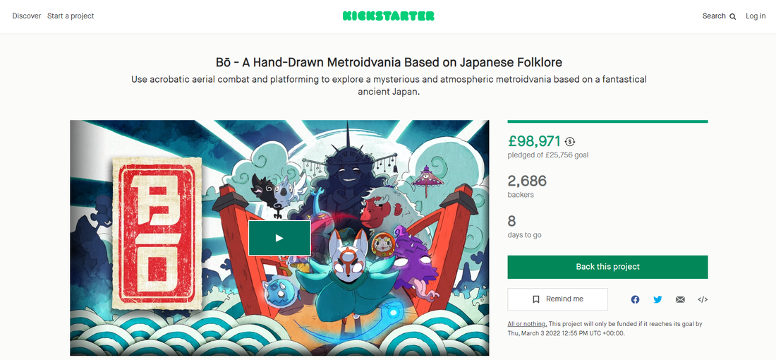
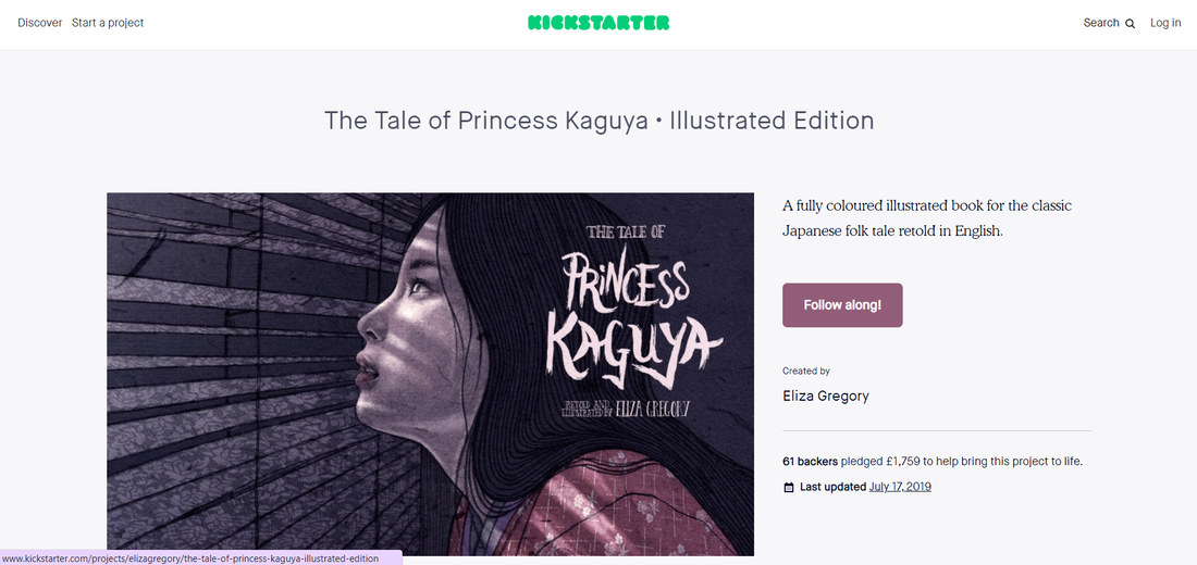
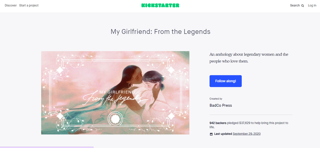
Successful Kickstarters
Although I had an understanding of the basics of Kickstarter, I wanted to carry out a little more research specifically looking at professional, successful kickstarter projects. I felt that this would provide me strong guidance for the quality level that I should be aiming for, and what should be included. I've linked the kickstarter pages to the images so they can be accessed and seen in full.
I also managed to find this video from a crowdfunding expert, discussing the key components of creating a successful kickstarter project.
Book Planning
|
When I was researching other picture books, when I found 'Leaf', I really loved the size and feel of the book. I thought it looked interesting, and that the longer format would work well for my fairytale. I then also found 'Studio - A Place for Art to Start', which was slightly taller and more square, so I decided to blend the two to create my own size.
The dimensions that I decided on were approximately: - height = 245mm - width = 270mm From this point, I was able to start planning the actual contents of the book. |
|
Initially, I wanted to make my book for preschool aged children, however, when I began rewriting the text, I found that it wasn't suitable for that age group, therefore I slightly changed my approach. The actual story was more suited towards an audience of around 8-12, so from that point, I worked with the aim of that target audience.
I found a website with a page of books geared towards the same age that I'm working for, so I felt that it would be helpful to keep for reference.
I found a website with a page of books geared towards the same age that I'm working for, so I felt that it would be helpful to keep for reference.
Dwayne had also said to consider which books I would like my book to be found next to on a kid's shelf so I thought that would be a good way to focus down on an even more specific look and audience. I knew that I wanted my story to essentially be a normal picture book, with more text on the pages, so that is what I was looking for.
The books I have decided on are:
The books I have decided on are:
The Artists
Kai and the Monkey King
The Cottingley Fairies
I also planned out each page on a large template so I knew how many pages I would be working with overall, and could input the correct amount when looking at printing. At the beginning of the project, I rewrote out my story so it was more accessible to a modern audience of the age range I was looking at, so I started by breaking that text down into sections to be illustrated.
|
I then created a template with my page sizes, printed it out, and began filling the pages with a plan for each illustration and page, including things like end pages and covers.
After I had done this, I knew exactly how many pages I would need to gain printing quotes more accurately. I had done some brief research closer to the start of the project, but I was now able to go more in depth with my specifications. |
Printing Quotes
I found obstacles with almost all of the printing companies I looked into. I checked Mixam first, but they weren't able to print end papers, both Swallowtail printing and Book Printing UK were extremely expensive for the sizing I was looking at, so Imprint Digital seemed to be the clear option, as it was extremely well priced, and they were able to create everything that I wanted for my book. They were also extremely responsive in comparison to the other companies, which also made me feel more safe using them.
Character Design
|
I knew that character design would have to be carefully considered for this project, so I decided to tackle that first in the development process. I thought a good place to start would be to look at recommended tips and then write down the traits of each main character, so that their actual design was reflective of their lives and personality.
I specifically found this masterclass character design page very helpful. |
Emilie
|
Emilie was taking on the 'lad' role in the story, as I have decided to swap the gender to make it a more progressive and representative tale for young children who will be figuring out their identity in the coming years as they grow. I didn't want the LGBTQ+ aspect to become the focus of the story though, so aside from swapping the gender and giving the characters names, the rest of the plot remains the same.
As she doesn't have a lot of character detail in the original story, it allowed me create my own idea of her character, so that was the kind of thing I worked out and through on my note sheet for her. I wanted her to be farm girl who is extremely strong-willed, and cares a lot for her role and responsibilities on the farm. She's content with her life up until she starts dreaming of Astrid (the princess character), and then her ambitions expand, and she becomes determined to meet the princess. It's at this point that her ambition is seen to be not only a great strength, but also a fault as it leads her to be put in potentially dangerous situations on her adventure. Overall, the goal was to create a character to be a strong role model, to show the readers that determination and hard work pay off. |
When designing her character, I wanted to make sure that her appearance reflected her role as a farm worker, so I mostly explored her having a slim, fit build, but I also made sure to try out different sizes and heights for the character, as well as different muscle masses. I also played around with the traditional Swedish dress quite a bit, in aims to figure what suited her character the best.
Astrid
|
Astrid took on the princess role in the story. Much like Emilie, she had very little depth or character exploration in the original text, so I thought that figuring out more background for her would help inform the illustrative choices that I made for her design.
As Astrid is the princess of the Mount of the Golden Queen, I wanted her to feel ethereal, and whimsical, which would enhance the dream-like aspect. Her poise and confidence was also something that I felt was important as she takes on a royal role, leadership, so I wanted that to be clear in her design. Something that I thought could be interesting to explore was her skin tone and ethnicity, as when I originally thought of a princess of a golden mountain, a white character didn't feel fitting. However, I didn't want to commit to something too soon before exploring potential design opportunities that I may have also been happy with. Overall, with Astrid, her character's responsibilities and attributes didn't indicate any particular look for her, so I had more opportunity to play in comparison to Emilie's design. |
Creating Book Illustrations
I wanted to begin with creating concept pieces so I could gain a sense of style and tone for my book that I could use as guidance while creating the rest. I didn't put much planning into either of the pieces, as I just wanted to feel out what style and colours I would be drawn to. It also allowed me to play with new brushes a little bit and get a sense of how I could integrate a watercolour feeling into my regular approach to illustration. After creating them both, I wasn't a massive fan of the colour pallets that I had chosen to create them, however, I was feeling more confident to start creating art work.
I then began creating spreads to go in my actual book, using my usual process.
Spread 1
Spread 2
Spread 3
Spread 4
Spread 5
Spread 6
Spread 7
Covers
End Papers
|
|
|
Mockups
|
Once I had created all of my final art work and added text on Photoshop, I downloaded some mockups and applied my art work to them. These were absolutely vital for creating my Kickstarter and making my book seem more convincingly real.
After I had created enough to see my favourite spreads in book form, I found one that showed a child holding the book, just to make the purpose and audience of the book more obvious. The next and final step once all of the mockups were made was to move onto creating my Kickstarter page to display my project. |
Kickstarter
At this point of the project, I had pretty much all of the material that I needed in order to start creating my Kickstarter page in order to display my book. Although this initially seemed simple, I really wanted to take my time, and get the page to look as good as it could. I really wanted to portray strong work and a sense of professionalism.
I began by reflecting back upon my research from earlier in the project so I had a sense of the kind of material that went onto Kickstarter pages, and then started chipping away through my own project page. The first step I took was creating banners to separate the large body of type into organised sections.
I began by reflecting back upon my research from earlier in the project so I had a sense of the kind of material that went onto Kickstarter pages, and then started chipping away through my own project page. The first step I took was creating banners to separate the large body of type into organised sections.
|
To create these banners, I looked specifically at my front cover illustration, and took key elements that I thought would look interesting, while also working with type as the focus. The obvious choice seemed to be the mountain element, as it was a a perfect shape to frame the text, while also being relevant to the story.
The illustrations were created using the same techniques and look of the actual book illustrations so the banners were fairly quick and easy to make. Similarly, I hand rendered the type in the same style as the title on the front cover, so that was rather simple as well. The next step was then to create the project image that would be positioned at the top of my project page and act as a thumbnail on the home pages of Kickstarter. |
After this, I put everything together with the mockups, the text, and a process video from Procreate to complete the project page.
Click here to view the whole Kickstarter project page.


