|
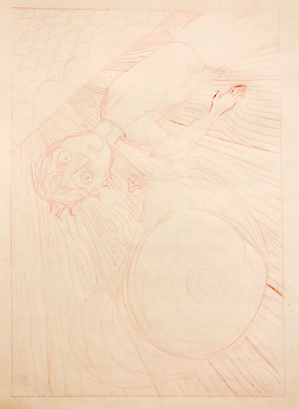
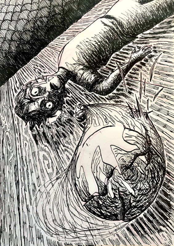
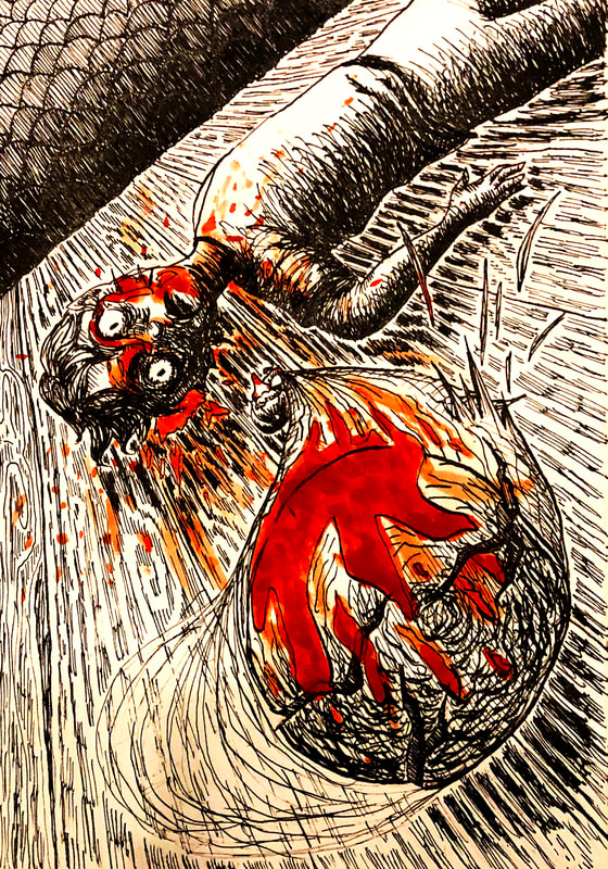
For our final task before Christmas, we were each allocated a text to base an illustration upon. I received 'The Mind and Dying of Mr Punch', by David Grubb - a poem following Punch, of Punch and Judy, and his depressive, murderous intent. The poem, upon a first read, was obviously a horror/ thriller, which caused my mind to gravitate towards Japanese horror Manga, such as the work of Junji Ito, and Suehiro Maruo. To start, I wanted to explore the Japanese horror style further, so I went to Pinterest and collected lots of images associated with the imagery, and any other images that interested me. I then wrote down the excerpt of the poem that I was given and highlighted the information that seemed important, and any interesting imagery. From there, I created thumbnail sketches based upon the lines that I selected, adapting my style to be more aligned with the Japanese horror approach. When creating the thumbnails, I really tried to stick to the points of the art direction, and if an idea did not match it initially, I attempted to modify it. It was a lot of fun to make such a haunting version of such an iconic children's character and story, and I really wanted to embrace the horror and contrast that the poem brought. Once I was happy with my thumbnailing, I selected my favourite design and sketched it out in pink pencil to the specified size. I did alter some of the drawing at this point for the sake of the image being more dramatic and legible. I then began to get to work with a dip pen and ink. I took this very slow and steady, while being calculated with my marks so I knew everything had the depth and appearance that I wanted. This took quite a long time as I was intentionally being very precise, but I really do feel that it was worth it. I'm extremely happy with it. Then, to finish, I used watered down gouache and added the blood to the illustration. To do this, I painted on the gouache in the large areas, and the small splatters, and then also used my finger to drag the paint around and smudge it. Overall, I am so beyond happy with this illustration as it's in a style, and with a medium I'm really not very comfortable with, and I think it turned out very well. The process also furthered my learning using dip pen and ink, and how dramatic and effective thoughtful marks are.
0 Comments
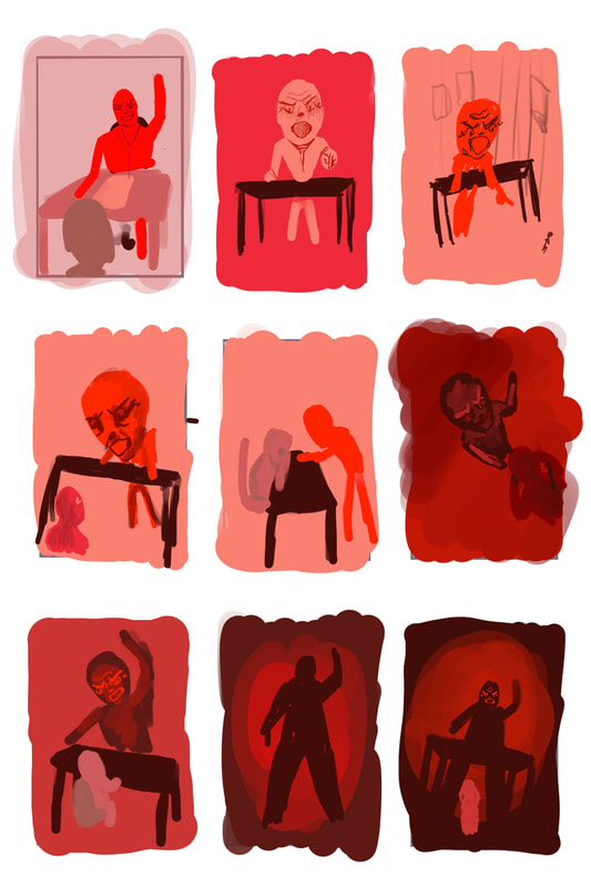
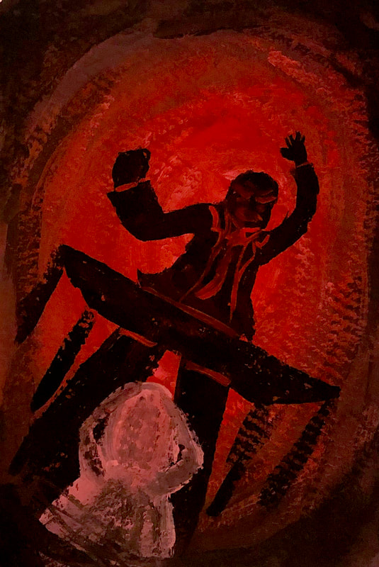
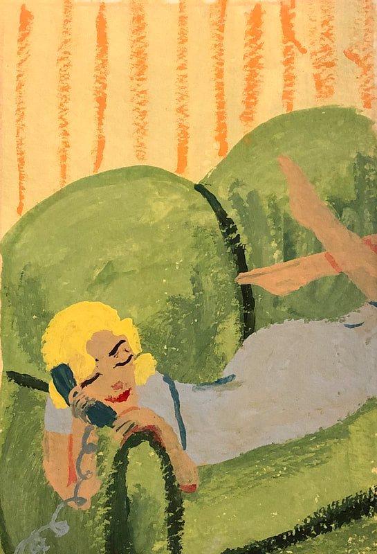
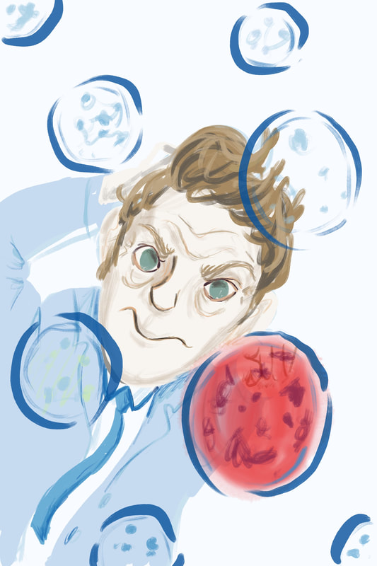
The next section of work, much like last week, was take on prompts to explore the use of body language to tell a story. I didn't realise how difficult this task was going to be until I started delving into creating the visuals, however, I really did try my best to create images with a clear narrative through gestural queues. I also wanted to maintain being aware of effective composition and use of colour. Angry Boss.Key words: -two figures -an office setting When I first began to visualise for this prompt, I was rather confused in my use of perspective. The boss in the situation looked more like an angry baby than intimidating; but eventually I realised that I needed the viewpoint to be from below rather than above. Then the images became much more dramatic and effective. Good News.Key words: -a single figure holding a phone -1950s As I started to thumbnail for this piece, I was spending far too much time putting details in, as the prompt really excited me, and I immediately had ideas in my head once I had read the key words. I'm glad I continued to develop from my initial idea, as I found I was much happier with the final visual rather than how I started. Mum can we go now?Key Words: - two old friends meet on the street, the teenage daughter of one doesn't want them to talk for long With these visuals, I really wanted to capture the mood of each character through colour, and of course, their body language. I remember being a lot younger and trying to drag my Mam and Dad around, but it having no effect on them at all - this was the narrative that inspired these images. The Anniversary.Key words: -a couple celebrating an anniversary in a restaurant. They hate one another... For this prompt, I wanted there to be a sombre feeling, which is why I went for the greyscale colouring. Aside from this, I also wanted to create lots of visual hints in the image to narrate the two character's feelings for one another. Examples of this are the burnt out candle, the clenched fists, and the fact that neither of them are looking at eachother. The Big Jump.Key words: -a figure in an aircraft just before having their first parachute jump As this prompt did not specify an emotion for the person who is going to parachute jump, I wanted to explore multiple scenarios in the thumbnail stage. In the end, I went for total fear, as I think it would be the feeling I would relate to most in that situation. In my opinion, there was no better way of illustrating this than the person using all of their limbs and power to keep themselves inside of the aircraft. Genius at Work.Key words: -serious concentration -academic or scientific setting As soon as I read the key words for this illustration, I knew I wanted to create a scientist, while using very pale, medical colours. I used the idea of the scientist studying petri dishes as my final piece, and used Procreate to carry this out. This is not my favourite final, as I feel that the expression of the scientist can be misinterpreted as confusion, instead of extreme concentration.
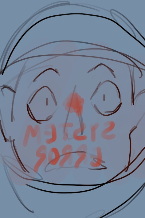
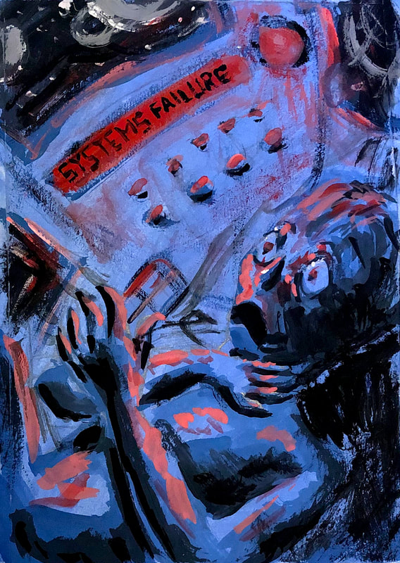
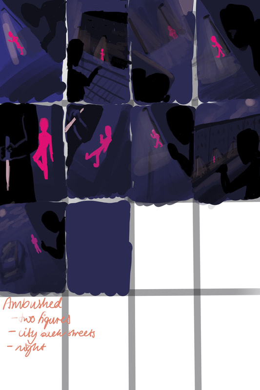
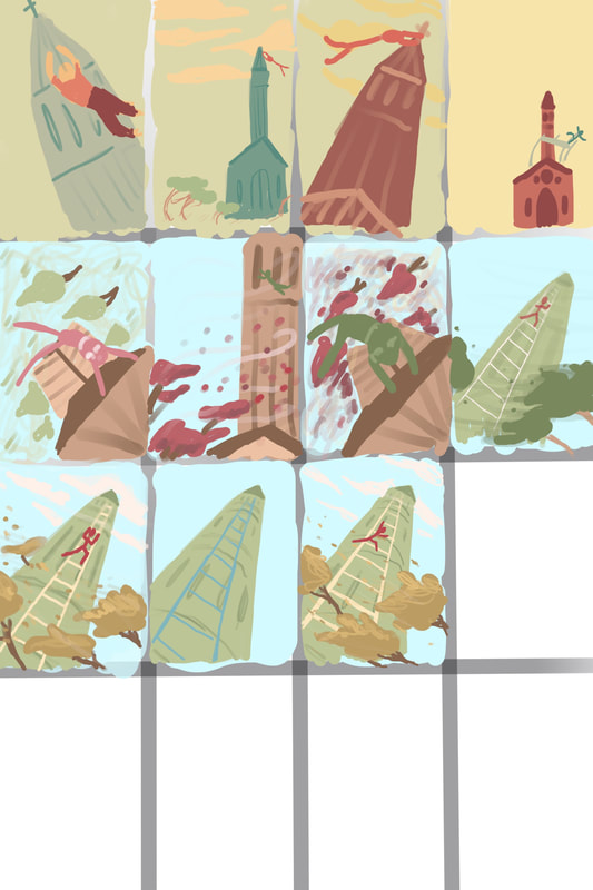
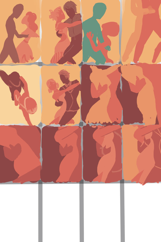
The first task of our third section was to explore composition, and the ways it can be exploited to aid narrative and story telling in illustration. I was really excited for these prompts, and I really do feel that I learned a lot from completing them. To start, I created a Pinterest board of examples of good composition. Then, for each prompt, I began by carrying out numerous thumbnails, in order to explore potential compositions in depth. Then once I felt that I had came up and developed an illustration I was happy with, I went in to create the worked up finals. Systems FailureThe key words for this prompt were: - One figure -Spaceship -Physical struggle From these thumbnails, I came to a composition that I was happy with, and used gouache to paint the worked up final in more detail. I really feel that I managed to capture the fear and physical struggle suggested in the prompt. Ambushed.Key words: -Two figures -A City's back streets -Night Like most of my worked up thumbnails, I used gouache to paint this image. Within my initial thumbnails, I tried to take on lots of viewpoints to emphasise being feeling of being watched. In the end, I felt that the view from behind the wall did this the most. Vertigo.Key words: -A steeplejack -Daytime -Windy day I found this prompt to be one of the most difficult of them all, as the weather was such a key part, and therefore, needed to be emphasised. In the end, I decided that the best way of doing this was to capture the movement of the trees, and also the impact of the strong winds on the steeplejack climbing the ladder. Tango.Key words: -Two figures -Movement -Sexy -Close -Exotic -Café I really loved this prompt, the key words inspired me, and I was excited to explore how to illustrate such intensity between two figures. As I created, and developed the thumbnails, I found that the shapes the body makes during a tango was very interesting, almost like they intertwined in motion. Therefore, a close-up of the bodies pressed together while dancing felt most appropriate. A Giant Leap.Key words: -Rooftop chase -Three figures -Peril -Bravery From there, I continued to use Procreate to develop the final image. I did this because I felt that the digital medium was best suited for the layered effects in the design I had created. January Sales.Key words: -Claustrophobia -Queuing -Doors opening -Multiple Figures I really struggled with this prompt in comparison to the others. I couldn't settle on an idea, and I felt that the majority of what I was producing didn't explain the story of the 'January Sales' efficiently. Therefore I decided to create a final of the thumbnail that I felt was the most legible, and matched the prompt best.
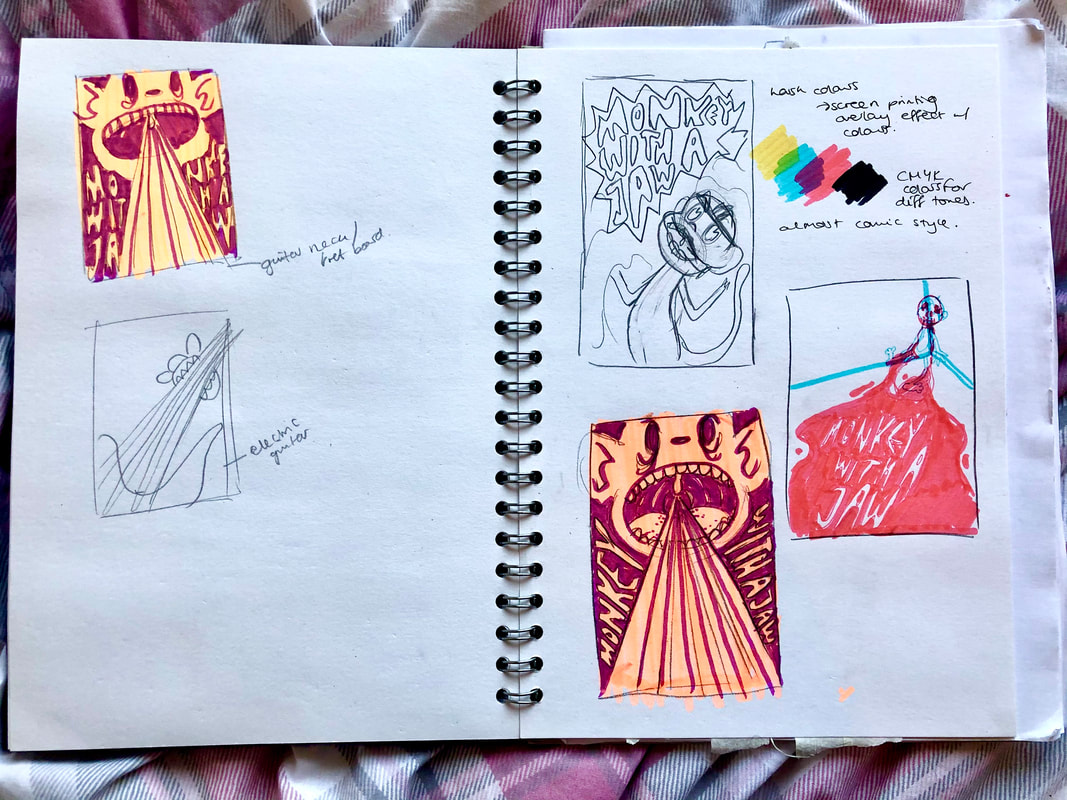
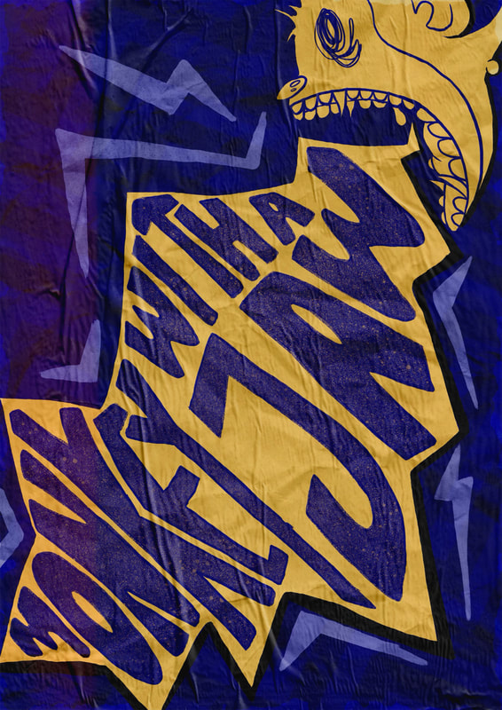
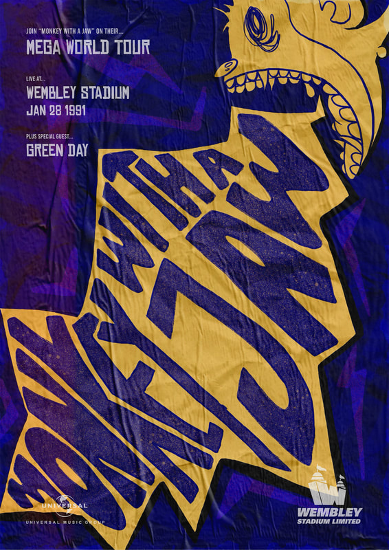
The band I was assigned for this project was called 'Monkey with a Jaw'. My first thought for the image was that they were a punk band, heavily inspired by the visuals of rock bands in the 90s. To begin, I created a pinterest board of all of the visuals that I felt matched the style I was going for. After finding lots of inspiration, I moved on to thumbnailing and visualising poster ideas. At first I tried to produce lots of visuals in lots of different styles. Then I narrowed the designs down to the ones I felt were most appropriate and effective for the band. I placed a lot of focus on maintaining the analogue, screen printed look to the posters. Because of this, I stuck to only a few colours of each design, and wanted to keep a layered look. Once I had decided which poster design I wanted to focus on, I created more thumbnails to explore its potential further. To finalise, I took my favourite design into Procreate. I decided to alter the colours slightly from the original thumbnail in order to make the poster more eye-catching. I also used lots of different effects in order to enhance the analogue feel of the poster. Overall, this turned out to be a design very different from what I normally do, but I feel that this aided the appearance as I wasn't familiar with the style. I was very proud of the poster in the end, and felt that it reflected the band very well. I ended up designing two final products - one to be a poster for bedrooms, more like an art piece or decoration; and the other to be used as a concert poster.
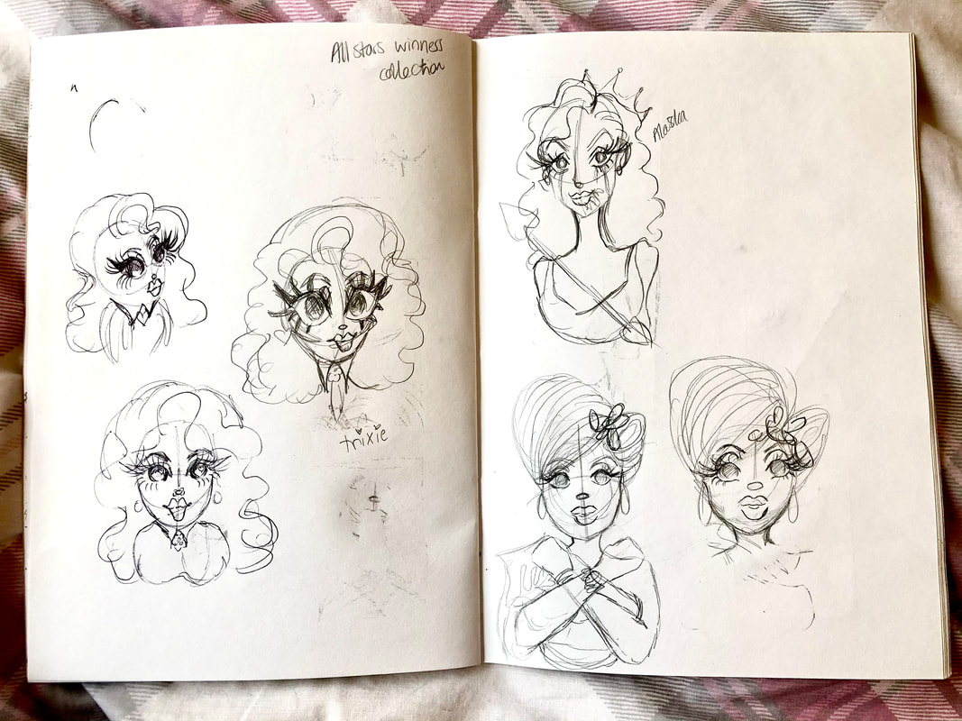
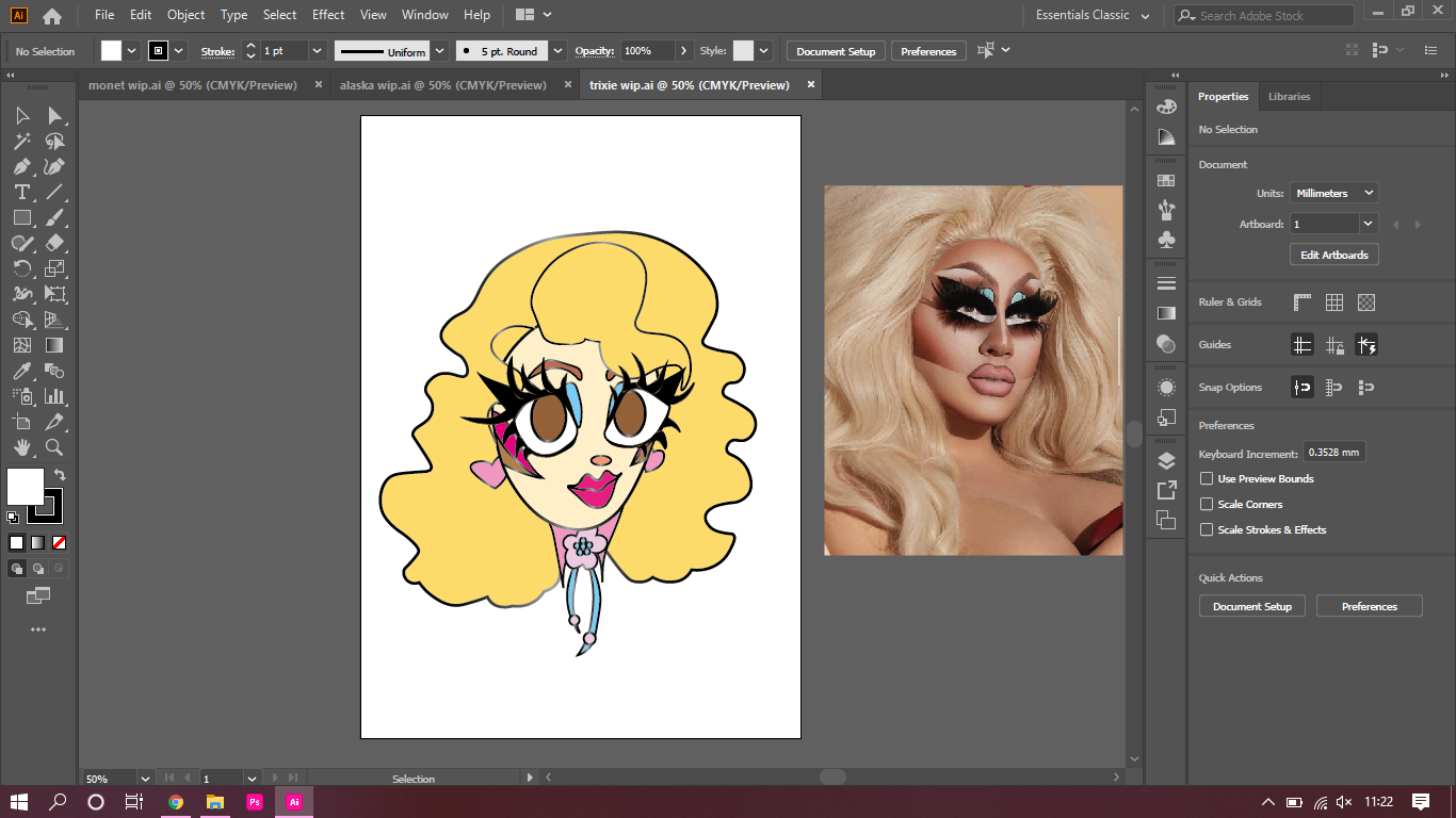
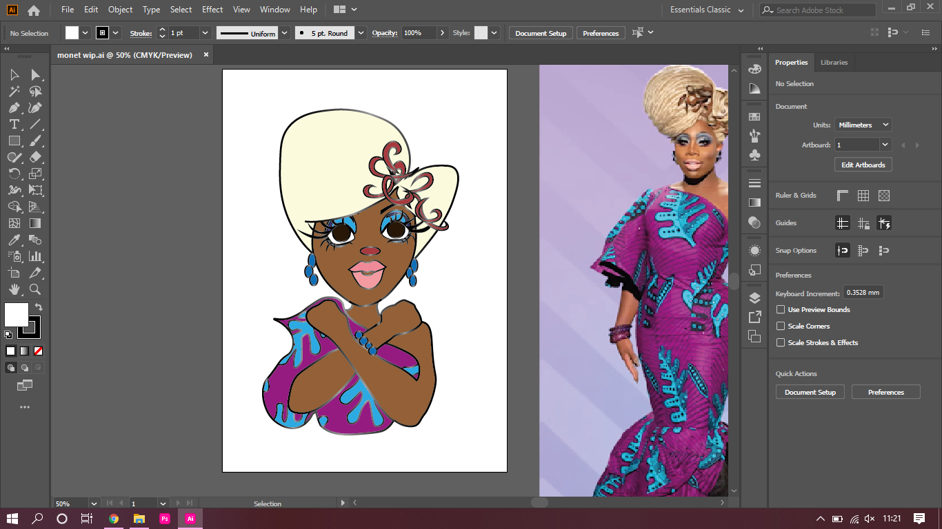
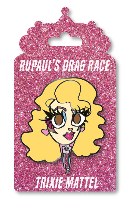
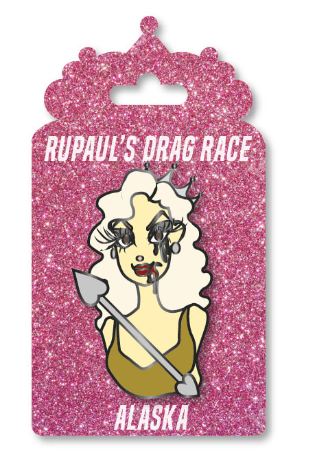
For this project we were given the task of designing enamel pins for a subject of pop culture. Initially, I wanted to create pins for Prince, as he was extremely iconic, and one of my favourite artists in all aspects. However, RuPaul's Drag Race seemed ideal for this type of brief as the Queens are already exaggerated characters, so I could really push the design as far as I wanted to. I began by sketching out the designs of the Queens that I wanted to adapt. I chose Trixie Mattel, Alaska Thunderfuck, and Monet X Change. After doing a sketch that I was happy with for each Queen, I took each drawing into Illustrator, and began to trace over the lines with blocks of colour. Once this was done, I placed a stroke around all of the lines as this would be the enamel lines. I spoke to Dwayne while still in the process of doing this, and he suggested to look more in depth into the limits and rules or creating enamel pins, and to alter my designs to suit the actual medium. Therefore, I increased the thickness of the stroke around each shape and colour, and removed all of the gradients from my designs. This is because gradients are not possible to create when making real enamel pins. I also looked into the possible colour options for the enamel, and decided that black enamel would best suit my designs for the clarity of the images. To finalise the designs, I then placed a gradient on all of the outlines in place of the black stroke. This was to emulate visually the idea of the enamel having a shine to it, but I made sure to keep the majority black so it was still clear that black was the actual colour of the enamel. Then, I designed the backing for the pins. I first created a tiara shape for the top, as a reference to the winner's crown, and then added a rectangular base. The pink glitter colouring was also a reference to the TV show as the 'Werkroom' is always almost entirely pink, as well as the runway. It didn't seem like there would be a more perfect colour. To finish, I added the text, the pins and drop shadows to make the pins overall appearance look more realistic.
When we were first told what this weeks task was I was so excited. I love painting, I find it very relaxing , especially watercolour. Although some elements were challenging, I found this week to more of a good refresher rather than learning something new. The only difficult part was adapting to different artists styles, rather than going off of instinct and muscle memory with the materials. I chose to look at the work of: J C Leyendecker; Ivon Hitchens; Eric Ravillious, and Peter Blake. This was to give myself various styles to emulate. J C Leyendecker.I knew when I saw Leyendecker's work that I wanted to do self portraits, as his own portraits are so sleek, and I love his style. The first painting I did start with an initial sketch, but this was the only one of all of the paintings I did. To begin, the paint was a lot more difficult to work with than I remembered, due to how fast it dried, but as I went, I figured out what worked out for me to get around that issue. Overall, I am very happy with these, especially the second painting, and I loved creating them. Ivon Hitchens.Ivon Hitchens' style was so much fun to replicate. His work is full of freedom, character and feeling, with imperfections, because of that, I didn't have to think too much about what I was doing when painting. The approach I took was going from place to place on the image, not worrying too much about elements matching up or looking exactly what they were based on. After trying this method, I believe that this is the key, and the magic to his style - the fact that it is so feeling driven, rather than being calculated. If anything, this freedom is what I learned most to appreciate in his paintings, and it is something I would like to try and adopt myself. Eric Ravillious.This style I actually found quite difficult to adopt, despite being in watercolour. Eric Ravillious' work seems so simple upon the first look, however, this is rather deceptive. There is so much work, and detail in his pieces, and I really struggled to replicate that. I think I also took too childish of an approach, as I made everything rounded, which also takes away from his style and imagery. Overall, I'm not very happy with this painting, but I did gain a better sense of how marks can be used to create texture in a painting. Peter Blake.This was my favourite painting to create by far. Initially, I didn't think much of Blake's style, but once I began my piece, I soon realised that his technique was very similar to the way that I enjoy working in watercolour. He focuses on layering and depth in with colour rather than large amounts of individual marks. His style and technique is bold and striking, using large amounts of bright colour, which is extremely difficult to create with watercolour. I don't think I managed to do this perfectly, despite this, I am very happy with my painting , and the overall look of the image.
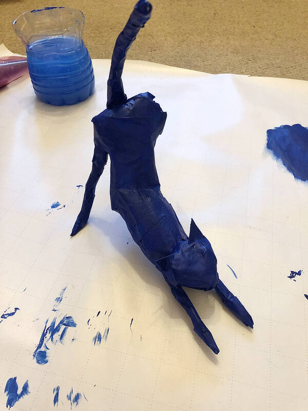
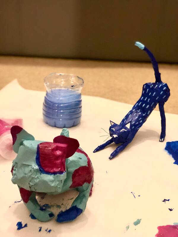
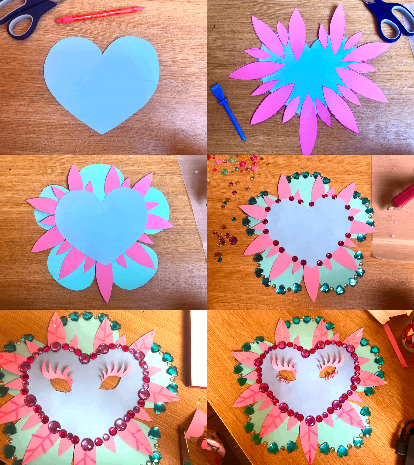
This weeks initial task was inspired by the work of Alan Fletcher in which he created animals out of rubbish with his grandson. We were instructed to create cats and dogs out of unconventional materials. The sculptures had to not only look like the animals, but also capture the character and essence them. I began by creating a cat, and soon learned that tin foil and masking tape was a very quick and easy method to make a sculpture base. Because of this, I also used this technique on my other animals. After creating the base of the sculptures, I then used acrylic paint and posca pens to add colour and detail. To finish, I then glued on any additional detail to add to the overall image of the animals. I honestly loved this task, it was so much fun trying to capture the character of the animals. My favourite was the cat by far, as I could reference my own cat, so I found it much easier to create a realistic shape and sense. Welcome to the Kennel!Lockdown Masks.The focused task of the week was to create a lockdown mask that we felt represented us. After the hours practice mask that we created during the lecture with Dwayne, I realised how much fun we could have with the masks, and that there were no wrong or right answers. Due to this, for my lockdown mask I decided to adopt some of the more simple, small things that make me happy, as I feel now more than ever we need to try and lift ourselves up as much as we can. When creating my mask I knew I wanted to use a flower shape as a base, with lots of gems and sparkly bits to embellish. I also managed to find some iridescent packaging strings while in the city centre, which worked perfect to add a little bit extra flare. To top off the mask, created paper eyelashes to frame the eye holes. This was inspired by drag culture, as it is something that I adore, and I feel exemplifies self expression.
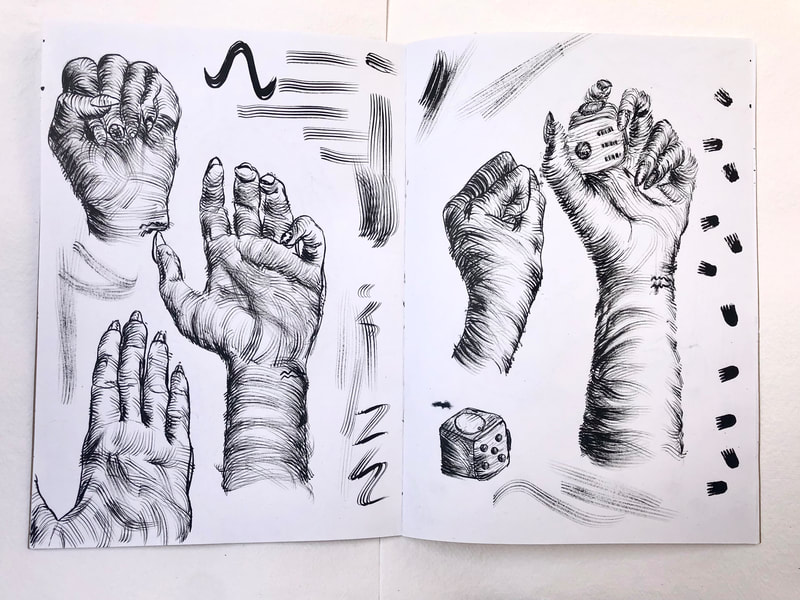
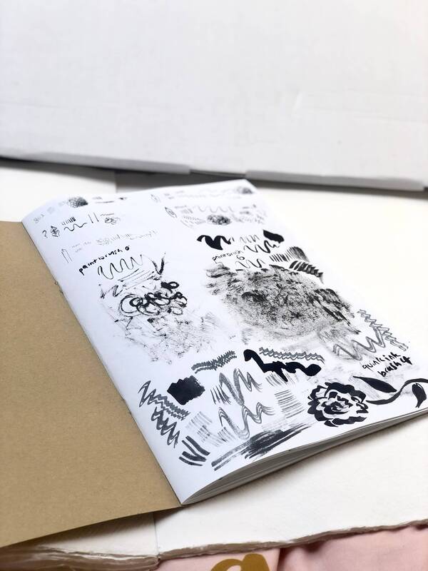
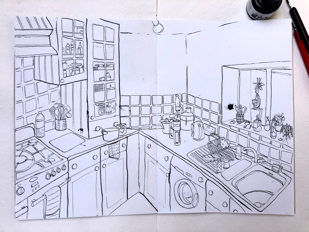
Overall, I love my mask, making it made me really happy. I love the feminised, almost pretty look of it, while still also being silly and fun. I began pen and ink week by playing with the medium, and testing out different techniques while drawing different subjects. The only instructions we were given was to focus on still life, so it was extremely easy to find subject matters for each drawing! I think this week has really pushed me because I wouldn't usually gravitate towards using pen and ink for a project - I really feel that I have learned a lot. I started by testing out my brushes and each nib for my dip pens. I also created a new brush by taking a flat chisel brush and then cutting slits in the bristles to create five individual lines in one stroke. It definitely became one of my favourite tools to use during the process. I then tested each nib with differing techniques for each page and drawing. It really allowed me to get a better sense of the best way to use the medium. I began The week was then finished off with the task of drawing a room inside of our house. It had to emanate the character and feeling of the room, therefore I chose to draw the kitchen as it is the area we spend the most time with each other within the house. My goal was to try and replicate the idea of the space being lived in, and almost busy in a sense. I began with a very basic pencil drawing just to map out the perspective of the room and then I went straight in with the larger dip pen. That was followed by details created with the smaller pen. I didn't want to sketch out too much initially, as I thought it would make the drawing look too calculated. The mistakes and wobbles give the drawing much more character in my opinion. To finish the illustration I then corrected any smudges or large blobs of ink with Tipp-ex to make it look slightly cleaner. Overall I'm extremely happy with the outcome, and surprised myself with how much I enjoyed the process.
|
|


